Sneak peek from SHOT 2017

armoredman

New member
Sort of, but built on frames and slides made here, not quite sure of all the details at all, just found this teaser pic this morning, thought it noteworthy.
 

DMK

New member
That rollmark is horrible. It looks sketched on as an afterthought.

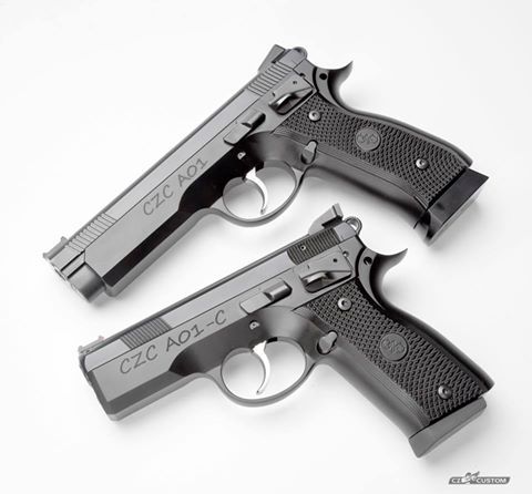
The full size gun looks pretty cool otherwise. The compact look odd. Too bulky in the front without the utility of a rail. They should have shaved that down like a PCR.
 

Skans

Active member
Ditto on the roll mark - but then again, I've never liked CZ graphics or logo. Also, both guns look a little bulky at the front of the frame.

Don't get me wrong, I DO like CZ guns...Just being a bit critical here.
 

rodfac

New member
Geez, could they have made the roll mark/logo any bigger? You could read those from a low-earth orbit. Rod
 
I like the CZ-75B and I love the CZ-75 Compact. With that established -- even without the horrendous rollmark (which is probably laser engraved rather than rolled), those are two of the ugliest pistols I've ever had the misfortune to lay eyes on.
 
Last edited:

kozak6

New member
That rollmark is repulsive.

It's a comic sans billboard. Comic sans has no place outside of a speech bubble or yellow box.

Anyone have any details about the pistols?
 
Top