You are using an out of date browser. It may not display this or other websites correctly.
You should upgrade or use an alternative browser.
You should upgrade or use an alternative browser.
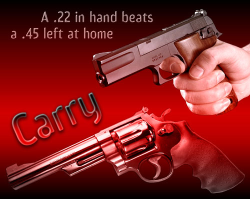
Re-make of an old poster (Carry!)
- Thread starter Oleg Volk
- Start date

Another vote for the 2nd poster over the first, but I'd like it even better if the 1911 was a bit more prominent, maybe moved up toward the top in the frame so the whole outline shows below the yellow banner.
I'd also prefer double quotes around "EXPECTING TROUBLE" over what's there now, but my real preference is nothing setting off EXPECTING TROUBLE.
I'd also prefer double quotes around "EXPECTING TROUBLE" over what's there now, but my real preference is nothing setting off EXPECTING TROUBLE.
MeekAndMild
New member
I like number two better.
1) I agree the size differential is more apparant and the little .22 LOOKS like a mousegun.
2) The fuzzyness and distance of the .45 makes it clear it is not really there but the sharply focussed .22 is.
3) The red background for poster number one is vaguely alarming and distressing. Red is the color of blood and fear and not of confidence ans safety.
4) The yellow and black analogy to seatbelts is one which needs repetition.
5) The hand in number one adds surprisingly little interest.
OTOH I like the caption for number one better than number 2 because the little gun is plainly a .22. It is not ANY gun, it is a .22.
Libertarian
New member
#2 is the better poster.
David Park
New member
I also like the second poster much more than the first, but agree with some of the problems mentioned above. Perhaps a vertical layout would work better, so that the .22 would not poke into the yellow banner (or at least not interrupt the flow of the text -- maybe you could add those diagonal black caution stripes as a border?). Also, the .45 could be seen uncropped, but still faded into the background with the text over it. The cropping is the worst flaw IMHO, and even simply extending the current poster down to show the whole gun would be an improvement.
My 2 cents.
My 2 cents.
Hmmm...
I'd rather reference 'insurance' myself since every adult with a decent IQ can relate to it.
To wit:
"People use seatbelts for inexpensive [cheap?] insurance against injury."
"People use [carry?] firearms [handguns?] for inexpensive insurance against criminals."
RE: the first pic...
Like the visual but would work on the contrast a bit; that reddish hue bothers me for some reason...can't say exactly why.
As usual, excellent work, my friend!
Johnny Guest
Moderator in Memoriam
I think the second one is better.
Perhaps the upper poster would be better if the .22 auto was replaced by the mini-revolver, and the background changed. . . .
Another vote for "normal quotation marks" as opposed to the <<whatever marks.>>
Best,
Johnny Guest
Perhaps the upper poster would be better if the .22 auto was replaced by the mini-revolver, and the background changed. . . .
Another vote for "normal quotation marks" as opposed to the <<whatever marks.>>
Best,
Johnny Guest
Miss Demeanors
New member
Another vote for #2 
LoneStranger
New member
I'm confused with the first line on the second poster.
"No one wears seat belts only when expecting an accident"
Would it work better like this?
"No one only wears seat belts when expecting an accident"
Otherwise they float my boat.
Let our edumicated brethern comment.
"No one wears seat belts only when expecting an accident"
Would it work better like this?
"No one only wears seat belts when expecting an accident"
Otherwise they float my boat.
Let our edumicated brethern comment.